Planty
Planty app is a source available to help individuals learn about gardening, including tips and tricks on how to choose the right plants for your area and how to care for them properly.
Deliverables
- User Research
- Wire-framing
- Prototyping
- Visual & Interaction Design
- Accessibility Design
Setting
Individual Project
Timeline
12 weeks
Role
UI.UX designer
The Problem
People often buy indoor plants impulsively, without understanding their specific care needs, leading to the plants’ premature death. There is a need for a reliable resource to help choose suitable plants for their living spaces and provide proper care guidance.
The Solution
A mobile app that assists users in selecting the right plants for their living spaces, based on specific environmental conditions and care requirements, and provides comprehensive care instructions to ensure the plants thrive.
Research
In developing a user-centric gardening app, my goal was to enable enthusiasts —from beginners to pros— to easily integrate gardening into their lifestyles, regardless of space constraints.
Through targeted user interviews with various age groups and by uncovering deep insights into the strengths and weaknesses of existing gardening apps, I established a solid foundation for my research.
This approach allowed me to guide my design, ensuring that our app not only supports gardening activities but also enhances the overall user experience.
Target audience
The target audience for a gardening app includes individuals passionate about gardening, such as home gardeners, hobbyists, and professional home stagers. These users look for features like plant identification, gardening tips, weather updates, and tools for tracking and planning their gardening activities.
Gardening transcends age barriers, making it difficult to pinpoint a specific age range for app users. Nonetheless, the majority are likely adults, given that gardening often requires access to land, equipment, and resources less accessible to younger demographics. Gardening apps can cater to various age groups by offering tailored features; for instance, older gardeners might appreciate reminders for watering or fertilizing plants, whereas younger users might be more interested in plant identification capabilities.
Research method
To confirm the hypothesis and gain insights into user frustrations with current applications, interviews were utilized as a principal research method.
The user interview technique was chosen for its ability to effectively achieve the research goals.
This method allowed for a thorough exploration of users’ interactions, challenges, and emotional responses towards gardening apps. It also provided a deeper understanding of their needs, preferences, and aspirations when it comes to gardening apps.
Empathy map
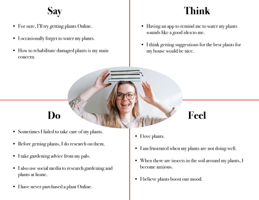
Following in-depth user interviews, I collected a rich set of qualitative data on user experiences and emotions.
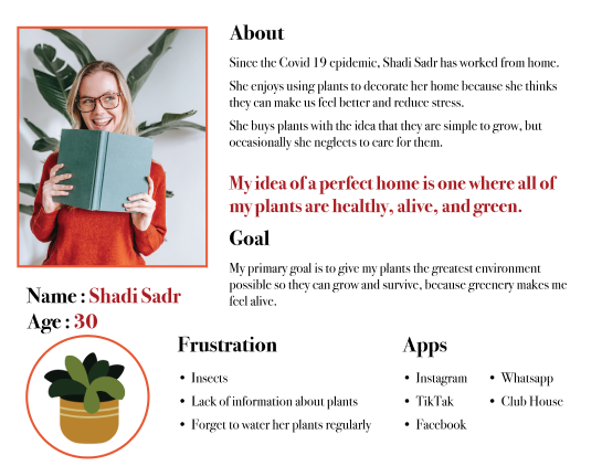
User Persona
Creating a persona helped me understand and empathize with users, ensuring the app design meets their need.
<span data-metadata=""><span data-buffer="">Define
Through user interviews and empathy mapping I captured a wide range of user needs, behaviors, and preferences related to planting and gardening also by analyzing the competition, I gained valuable insights into industry standards, user expectations, and potential gaps in the market.
These combined insights laid the foundation for defining key features and value proposition of the Planty app.

<span data-metadata=""><span data-buffer="">Problem statement
- Many homeowners lack specific knowledge on plant care.
- Inadequate care leads to poor plant health or death.
- This impacts home aesthetics and environment.
- Resulting in a less inviting and more stressful living space.
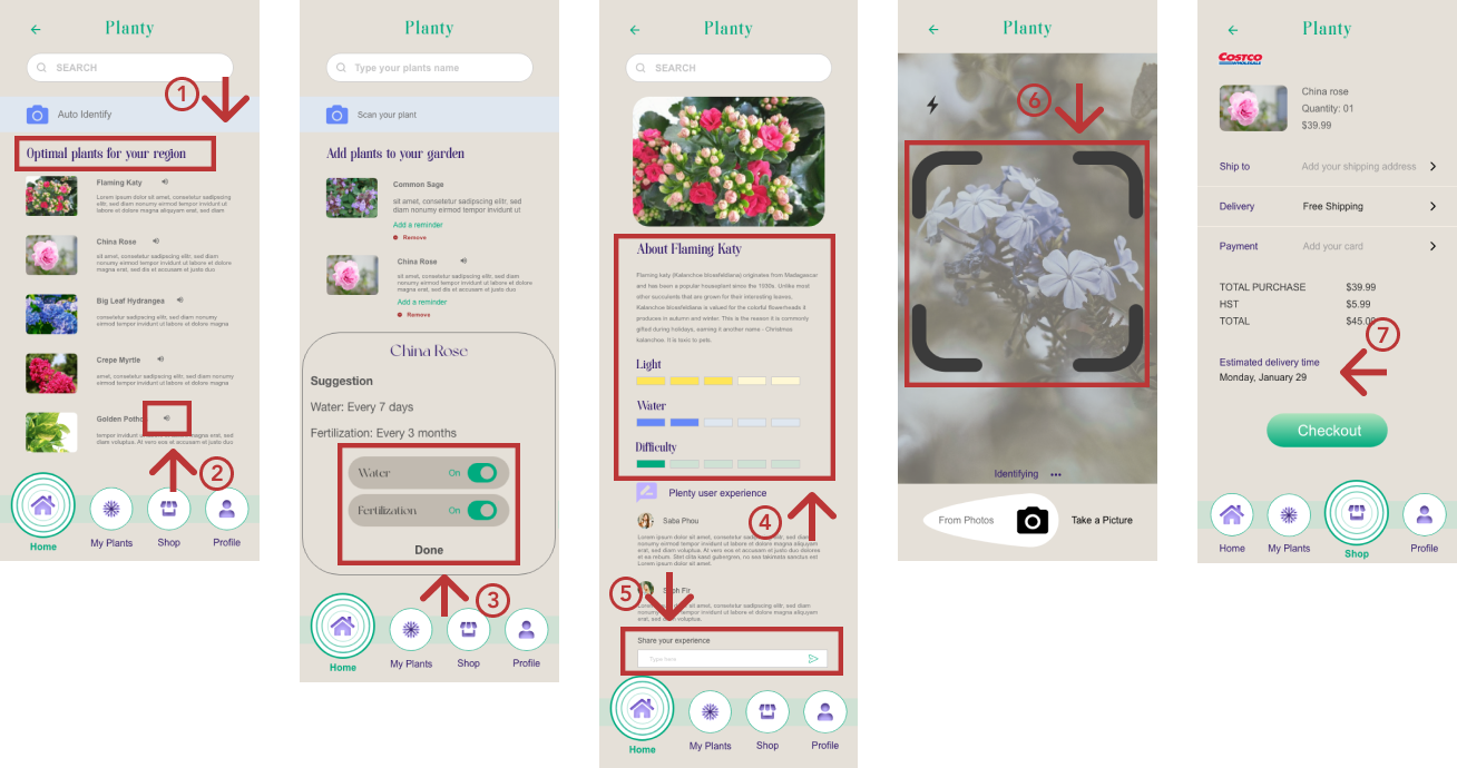
Key features and Value proposition
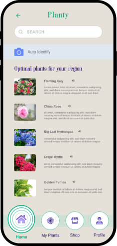
- Personalized Recommendations tailored to users’ environments.
- Enhanced Accessibility with voice assistance and high-contrast visuals.
- Reminders for Watering and Fertilizing via automated notifications
- Comprehensive Plant Database with detailed care guidelines.
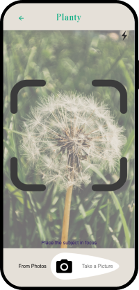
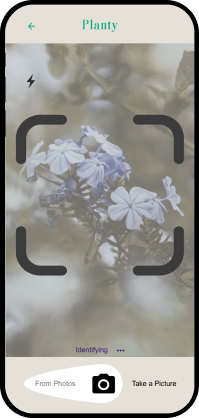
- Plant Identification through photo recognition.
- User Reviews and Feedback for community exchange.
- Convenient Online Ordering and Delivery within the app.

Value proposition
- Personalized plant care instructions for each homeowner.
- Ensures plant health and vitality.
- Enhances home aesthetics and ambiance.
- Promotes a stress-free living environment.
Design and Validation
Upon defining users need, I transitioned to the design phase, aiming to create solutions for the identified challenges and meet the Planty app’s objectives.
I validated the design through two rounds of usability testing, refining it post-feedback from both low and high-fidelity wireframe stages to improve the solution.
Low-fidelity wireframes
Low fidelity designs focus on basic concepts without detailed features and use an iterative process to ensure a cohesive design.
Mid-fidelity wireframes
After completing the low-fidelity wireframe sketches, I progressed to create mid-fidelity prototypes to breathe life into the design.
Usability test 1
I conducted usability testing to quickly collect insightful feedback, allowing me to move on to the high-fidelity design.
Hi-fidelity design
Following the initial round of usability testing, I adjusted my design based on user feedback.
I then created high-fidelity designs, considering UI principles, and here is my approach for the UI journey.
Design Approach
Colors – Typography
App’s name
The name “Planty” combines plant and plenty, highlighting the plenty of best practices and resources available for plant lovers.
App’s icon
The cactus signifies that you don’t need to be a green-thumb genius to start, while the curves represent the joy of exploring nature’s mysteries, one plant at a time. It conveys that gardening is easy and full of surprises. This icon reflects Planty’s mission to bring gardening joy to everyone.
Hi-fidelity wireframes
Usability test 2
Upon completing the high-fidelity design for the app, I initiated moderated usability testing, involving three participants in the 20-40 age group. Their feedback and experiences were crucial for enhancing the app’s user interface and overall user experience.



Testing script
Three users participated in the testing of this prototype; they were requested to sit in front of a laptop and were free to use it without being bothered. They all agreed that the design had a good overall vibe, and as they explored each page, they each had recommendations for how to improve the app. The app lacked a few buttons, some call to actions weren’t functional, and it also contained excess information which users weren’t satisfied and some missing elements that needed to be added.
Feedback based on user testing
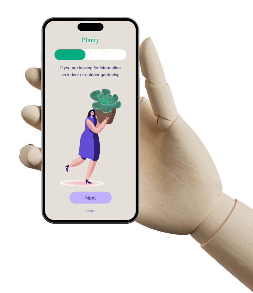
The app has three steps of introductions that are followed by a call to action button. The CTA button was called “Get started,” but users have suggested changing it to “Next” because they found it to be a bit frustrating.
There was also a “create an account” button on the introduction pages, but users have preferred to change it to login.
Users who created accounts in the first design had to fill out two pages about themselves, which they felt was unnecessary. Hence, with the redesign, I have create one page for account creation and another for users to update their information if necessary.
Also, there was a section where users could buy plants, but I failed to develop a call to action for that process. As a result, users were curious about what to do next after selecting the plants they wanted to buy, so I designed a page for check out processing and a few minor adjustments were made in response to user requests.
Final Design
Accessibility considerations
To cater to users with hearing challenges, my app features a button with a speaker icon next to each plant’s name. Additionally, I’ve ensured that color contrasts are thoroughly checked to meet accessibility standards, making the app more inclusive and user-friendly for individuals with visual impairments.
Takeaways
Through the Planty app project, I absorbed the essence of user-centered design, learning how closely app features must align with user needs for maximum impact. I recognized the powerful link between thoughtful design and the enhancement of personal environments, directly affecting user well-being. The iterative nature of refining the app through constant feedback taught me the value of adaptability. Integrating accessibility features highlighted the importance of inclusive design, ensuring the app serves a broad audience. These insights have been pivotal in sharpening my UI/UX design skills for future endeavors.